At least that’s what I keep telling myself. Truthfully I couldn’t be more desperate to hit the beach. Temperatures here today have officially hit the “blow this popsicle stand” mark, hovering around -30 with the wind chill. However, since out of country travel is out of the question with this pregnancy, I’ve decided to keep myself very busy while my friends are away.
Not like we haven’t got a full enough plate with two babies on the way and all the preparation needed for them, I’ve decided that Isla’s room needs an overhaul, very desperately. We moved into this house about a year and a half ago, and have been busy completely redoing the main floor (more on that later). Since our house is mainly open concept, there was no hiding the garishness that we were left with, it HAD to be done, and right away! However, now that the first phase of the main floor is completed, I have decided that little Isla comes next.
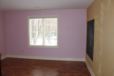
I have been pouring over Pinterest, various blogs, and magazines to get inspiration for my little princess’ abode. I spent a lot of time designing a beachy themed nursery for her first room, however we left that behind when we moved to this new house. What we were left with in Isla’s current room were three walls painted a goldenrod yellow, one bubblegum pink wall, a large painted on chalkboard surface, a hideous green window covering, and a dim main light that resembled the sun. Here is her room pared down and prepped for painting:
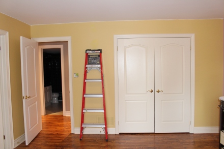
“Isn’t that a lovely goldenrod?”- Said no person, ever!

Goodbye chalkboard!
More to come on my plans for this window wall
For some reason when I was planning her nursery I didn’t want it to seem to girly, even though I knew I was expecting a little lady. Clearly I was having one of those “cloudy judgement because I’m pregnant moments”, since half the fun of having a girl is all the girly stuff! Having said that, I won’t be running out to buy all the bubble gum pink accessories I can find. Some maybe, but not all.
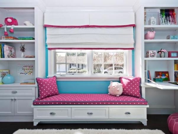
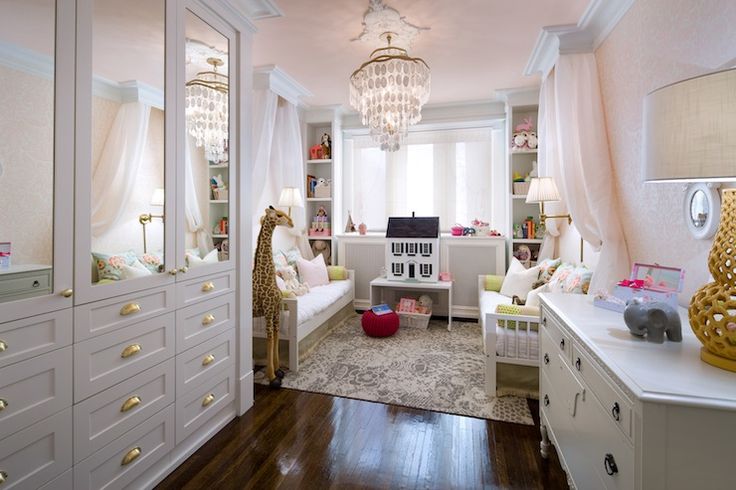
I have decided to use this little girl’s room Candice Olson designed years ago that featured soft pink walls, white furniture, and gold accents as my inspiration:
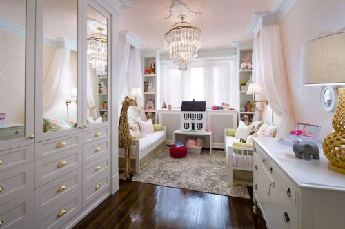
Darling Pink and Gold room by Candice Olson
I have loved this room since the moment I laid eyes on it. However, I will be changing the look quite a bit to reflect Isla’s personality and interests. I have decided not to wallpaper, since my previous attempts at it were like inflicting some sort of slow, modern-era torture on myself. Bottom line, I suck at installing wallpaper. What I don’t suck at is painting. I’ve done a lot of it over the years (seriously a lot, we’ve lived in six houses already and I’ve been the sole painter at each one) and feel very comfortable doing it. Therefore, a little more Pinterest research and I was off to my favourite local paint store to pick up some Benjamin Moore swatches. (While I’m sure there are many other great brands of paint out there, Ben has never failed me. Their colours are almost always identical to the swatch, and the quality of the paint is lovely to work with and durable).
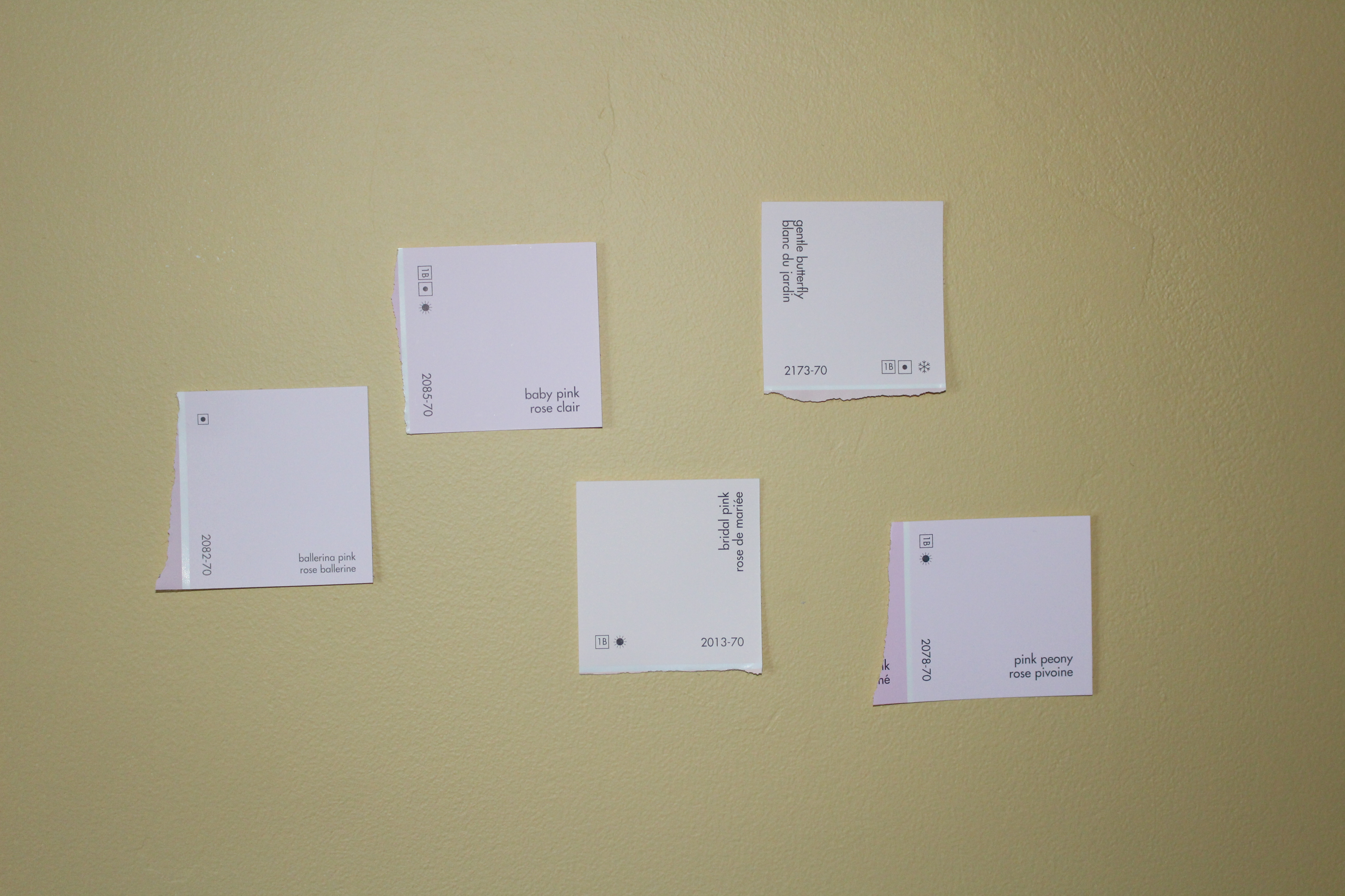
One thing I discovered from the knowledgeable clerk at my paint store is that many of the paints that are pinned are from the US Benjamin Moore stock (apparently our friends south of the border even have more paint selection!). She was able to dig out a set of US swatches, which is where we found: Pink Orchid, Blanched Coral, and Pink Cloud. I was told that while they are able to use the codes to make up these colours in Canada, they did not have a swatch that I could take home. I decided to get to work trying to match some Canadian colours to my favourite US ones, so that I could bring something home to take a look at. Here’s what I cam home with:
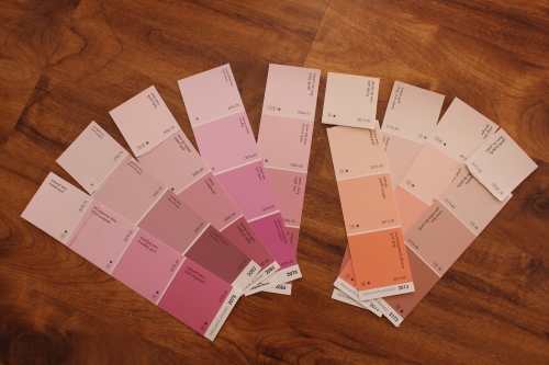
Benjamin Moore pink swatches
It didn’t take me long to rule out the bubble gum set of pinks- not the look that would get me the sophisticated girl’s room I was going for. I took some of my favourites down to test on various walls and in various lighting in Isla’s room:
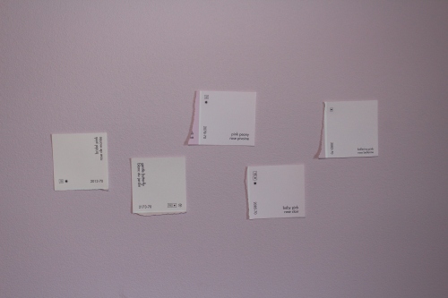
Testing out swatches against the existing pink wall
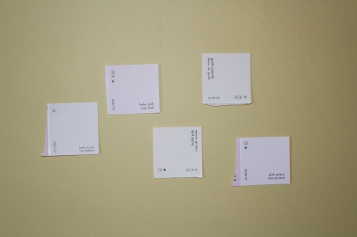
…and against a yellow wall
I decided that I wanted to go very pale pink, so narrowed down my choices even further to Bridal Pink and Gentle Butterfly. I then went back to the paint store with both swatches to get their expert advice. I wanted to know what the differences were in the amount of colour ingredients used to make up each colour, since I don’t want any surprises with a rogue blue or purple shining through. It was explained to me that Bridal Pink would have a peachy undertone whereas the Gentle Butterfly would have red undertones. While I love a peachy undertone, I was afraid that it would clash with other pinks, or that the gold accents would bring out too much of the peach. Gentle Butterfly for the win!
One can of low-VOC Regal Select, one heavy-duty N95 mask and I was on my way. The Regal Select was recommended to me when I explained that this would be the room of a toddler, so I wanted something durable that could be wiped time and again. (And for those of your worrying about me painting while pregnant I can assure you that I have taken precautions including wearing a mask, cracking a window, and keeping on the external fan in Isla’s adjoining bathroom on as well as taking breaks and drinking lots of water).
I have since finished the first coat, and while it may not look like much right now, I can already see things coming together!

Looking forward to seeing the transformation after painting the doors and trim white…
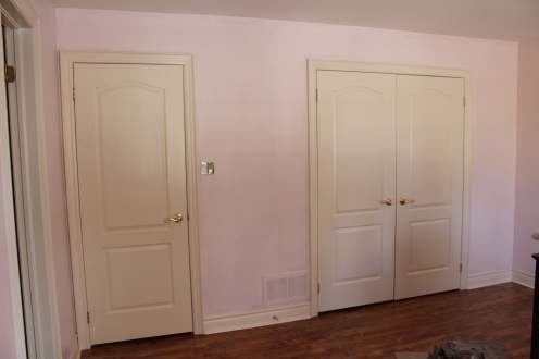
…and after a second coat
I’ll be completing the second coat of paint tomorrow, followed by painting the trim (BM-Cloud White), and much more! Check back for more updates as this room progresses into something I hope little Isla will love.